Mobile-First Strategy: How Accessibility and Inclusivity Are Driving the Shift
With over 60% of global web traffic coming from mobile devices, it’s no surprise that companies have shifted their digital strategies accordingly. The mobile-first approach isn’t just a buzzword, it’s a critical mindset for designing inclusive, accessible, and future-proof digital experiences.
This strategy was born out of necessity. As more users began accessing services on smartphones and tablets, businesses had to rethink how they designed, developed, and delivered content. But beyond optimizing for screen size, mobile-first thinking has grown into something bigger: a push toward accessibility and inclusivity that benefits all users, not just those on smaller screens.
Tech giants like Google, Microsoft, and Apple have embraced this shift, integrating mobile-first principles into nearly every product release. For businesses of all sizes, taking a page from their playbook could mean unlocking new audiences, improving engagement, and future-proofing user experiences.
What Does Mobile-First Strategy Truly Mean?
The mobile-first strategy is a design and development approach where the user experience is prioritized for mobile devices first, before scaling up for tablets and desktops. This means thinking in terms of constraints: smaller screens, touch inputs, slower connections. But those constraints are what make mobile-first such a powerful tool for innovation.
What it is:
- Designing for the smallest screen first, then adapting for larger devices.
- Creating fast, focused, user-friendly experiences on mobile platforms.
- Emphasizing functionality, load time, and intuitive navigation.
What it isn’t:
- Merely shrinking desktop content to fit a mobile screen.
- An optional add-on to your desktop-first web design.
- Only relevant for e-commerce or consumer-facing brands.
Why It Matters for B2B
For B2B companies, especially those building enterprise platforms or digital tools, the mobile-first approach can seem like a lower priority. But in reality, more decision-makers and buyers are working remotely, managing tasks on the go, and accessing reports or dashboards from their phones. Ignoring mobile-first puts you at risk of alienating key stakeholders in the buying process.
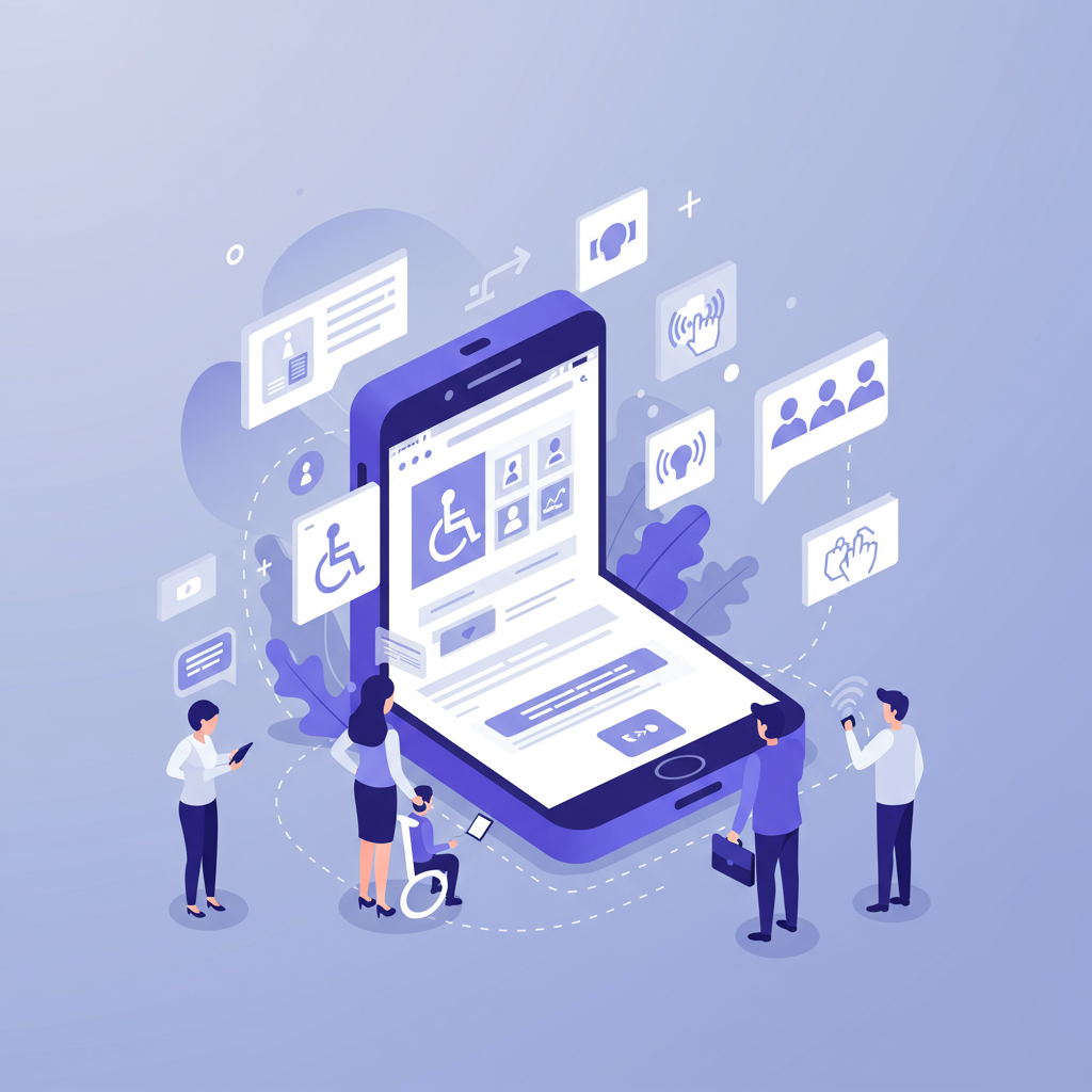
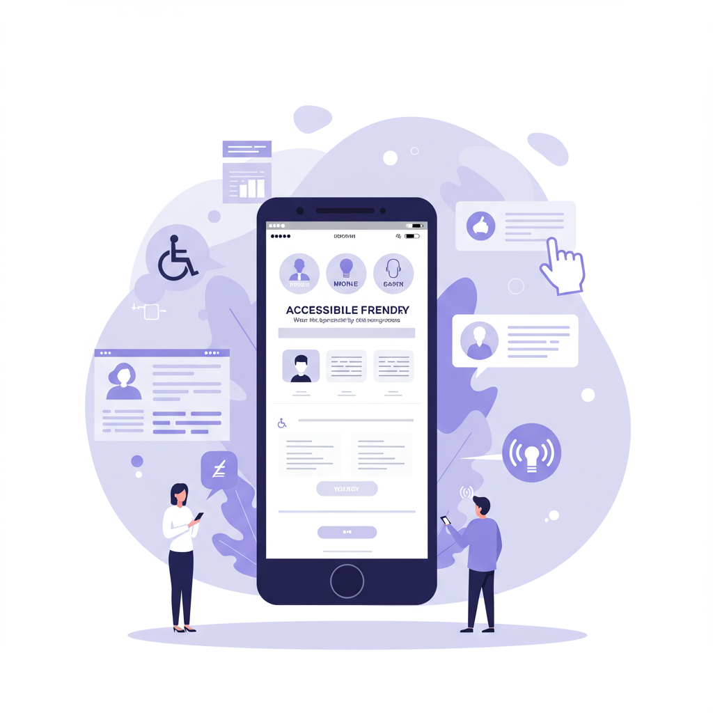
How Mobile-First Enhances Accessibility and Inclusivity
At its core, mobile-first strategy makes digital content easier to access, and that’s where accessibility and inclusivity enter the conversation. When done right, mobile-first design supports a broader range of users, including those with disabilities or situational limitations (like working in bright sunlight or using a single hand).
1. Text Scaling and Responsive Typography
Modern mobile-first design embraces scalable fonts and responsive typography. This means users with visual impairments, or simply older users with changing eyesight, can zoom in without the layout breaking. Large text guidelines are baked into accessibility standards and benefit every user, not just those who rely on them.
Many leading operating systems (such as Apple’s iOS and Google’s Android) allow system-wide text resizing. A mobile-first website or app must accommodate that, adjusting seamlessly to larger fonts without compromising structure or usability.
2. Voice Commands and Screen Readers
Mobile-first platforms typically support voice navigation and screen readers, which are critical for visually impaired users or individuals with mobility challenges. When developers prioritize mobile interfaces, they often naturally build in compatibility for these assistive tools.
Voice commands aren’t just helpful for people with disabilities, they’re used widely in hands-free environments. Think of a doctor referencing a report on their phone using voice search, or a warehouse operator using speech to pull up inventory stats.
Apple’s VoiceOver, Google’s TalkBack, and Microsoft’s Narrator are prime examples of screen reader tools that integrate tightly with mobile-first design systems. Companies that embrace these accessibility layers not only comply with regulations, they empower more users to interact with their brand.
3. Touch-Friendly Interfaces
Accessibility isn’t just about vision or hearing. Motor skills matter too. Designing for touchscreens encourages larger buttons, intuitive gestures, and reduced reliance on fine cursor movements, all of which improve usability for people with tremors, arthritis, or other motor impairments.
Mobile-first design encourages “thumb zones” and avoids tap targets that are too small or clustered. These small choices reduce cognitive and physical effort, improving the experience for all users.
4. Compatibility with Assistive Technologies
Beyond voice and screen reading, mobile-first experiences must be compatible with third-party accessibility tools such as:
- Switch control systems (for users with limited mobility)
- Braille display readers
- Captioning tools
- Haptic feedback systems
Companies that adopt mobile-first frameworks tend to integrate APIs and technologies that ensure compatibility. For example, Microsoft’s inclusive design principles focus heavily on such integrations, ensuring their platforms remain usable across a spectrum of physical and neurological conditions.
The Business Case: Why Accessibility is Not Just Ethical, It’s Strategic
Making your mobile presence accessible isn’t just the right thing to do, it’s also good for business. According to the World Health Organization, over 1 billion people worldwide live with some form of disability. That’s a massive, often underserved audience.
But beyond disability, mobile-first accessibility benefits:
- Multilingual users (through simplified UI)
- Aging populations
- Users with temporary impairments (e.g., broken arm, eye strain)
- Users in low-light or noisy environments
- On-the-go professionals working remotely or during travel
Designing for the edges improves the experience for everyone. And companies that embrace inclusive design tend to see:
- Lower bounce rates
- Higher engagement
- Better SEO rankings (Google prioritizes mobile-friendly sites)
- Stronger brand reputation
Companies like Google champion “inclusive UX” not just because it broadens access, but because it sharpens performance. Accessibility forces simplicity and clarity, two attributes every user values.
Common Misconceptions About Mobile-First Accessibility
Despite growing adoption, some organizations still hesitate to embrace a mobile-first strategy, often because of persistent myths that no longer reflect today’s user behavior or technology landscape. Let’s debunk a few of the most common ones:
“Mobile-first is only for B2C brands.”
This assumption is outdated. While consumer-facing apps and eCommerce platforms led the mobile revolution, B2B buyers are now just as mobile-dependent. In fact, many executives research vendors, read industry blogs, or open emails while commuting, between meetings, or using personal devices. A mobile-first experience ensures that your content and tools are accessible wherever decisions begin, not just when they reach a desk.
“Our users prefer desktop.”
Even if your primary audience works in a desktop-heavy environment, mobile is often the first or fallback touchpoint. Prospects might revisit a resource they bookmarked, check emails on their phones, or quickly access a case study during a meeting. If the mobile experience is clunky or inaccessible, it risks creating friction that stalls engagement. Mobile-first doesn’t mean ignoring desktop, it means designing for the most constrained space first and scaling up from there.
“It’s more expensive to design responsively.”
It may seem that way at first glance, but mobile-first design often reduces long-term costs. By focusing on simplicity, core functionality, and user hierarchy early on, mobile-first development helps teams avoid over-engineering features that don’t add real value. Instead of retrofitting large-scale interfaces into smaller screens, mobile-first forces clarity from the start. The result? A leaner, more efficient build that performs better across all devices.
But in reality:
- Many B2B buyers start their journey on mobile.
- Employees and executives alike depend on mobile access to tools.
- Mobile-first design often streamlines development by forcing clearer hierarchy and functionality.
Mobile-First is Human-First
Mobile-first strategy is ultimately about putting users first. It’s about meeting people where they are, on the devices they prefer, and ensuring they can engage meaningfully, regardless of ability, context, or tech-savviness.
At its core, a mobile-first strategy isn’t just about optimizing for smaller screens, it’s about designing experiences that prioritize people. It’s rooted in the principle of meeting users where they are, on the devices they rely on most. From busy professionals juggling work between meetings to individuals with accessibility needs, mobile-first ensures that every interaction is inclusive, frictionless, and built for real-world use.
This means designing with responsiveness, clarity, and simplicity from the start, so that content, features, and workflows are accessible not only on mobile, but also across tablets, desktops, and assistive technologies. Whether it’s text scaling for aging eyes, voice navigation for users with limited mobility, or streamlined interfaces for on-the-go usage, mobile-first design respects the diversity of user contexts and abilities.
Big tech companies are leading the charge. Google’s Android accessibility tools reach billions, while Apple’s VoiceOver and dynamic type scaling have become accessibility standards. Microsoft’s enterprise apps are now optimized for mobile collaboration, reflecting the new reality: users expect full functionality and usability, regardless of device or ability.
For B2B organizations, this shift is critical. Decision-makers don’t wait to be at their desks to research vendors, explore content, or collaborate with their teams. By embracing mobile-first design, B2B companies show that they understand modern buyer behavior, respect user diversity, and value accessibility as a business imperative. In today’s landscape, mobile-first isn’t just a UX choice, it’s a brand differentiator, a growth driver, and a foundational step toward digital maturity.
In the second part of this series, we’ll dive into how mobile-first design enhances user experience and performance metrics, and how it can help drive engagement, retention, and business results.